List of Participants - click on names to view prints
Judy Barrass - Noosa Heads QLD
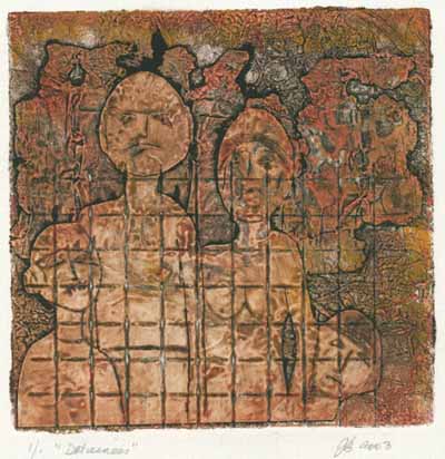
"Detainees"
The title 'Detainees' refers to shifting (and hardening) attitudes towards the people entering Australia illegally. They may at first be referred to as 'refugees' or 'asylum seekers', then perhaps 'illegal immigrants' and later when all their avenues of appeal have been used up, as 'detainees'. The next step is 'deportee'. I wanted to use found materials to make the plate - the sort of things one might find lying around a detention centre in central Australia, and to portray some of the desperation that leads families set fire to their own accommodation and allow their teenage children to sew their lips together. The fence is a bit of wire mesh. The figures are cut out and drypoint on an aluminium coke can. The background is a rusted bit of an old car radiator and some aluminium foil. It didn't work as a plate, but I think the idea could still take some exploration.
Anthea Boesenberg -
Mosman, NSW
Warringah Printmakers Studio, Sydney
Printmakers,
Print Council of Australia
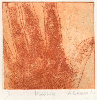
My print ’Handmade’ is an etching on zinc plate with textured Japanese paper chine collé. I used Puretch film as a resist and the etchant was copper sulphate. The paper is Hahnemuhle 300gsm, and the ink is Charbonnel Sanguine. It is the first print I have made using Puretch, and the first of a series on aspects of my own body. There’s an edition of 24 and two artist’s proofs.
Carole Carroll - Seattle WA, USA
Title:
'Union'
Type: Relief
Paper: Arches Cover
Ink: Daniel Smith Water Soluble Relief Ink
Plate: Copper foil distressed and embossed with found metal and metal number
stamps. Inner plate attached with found copper wire.
Edition: 25
Colleen Corradi
-
Montesilvano, Italy
Webpage: www.calcografie.com
(image stitched from two scans)
'War Crime ' For the image, I first edited a war related photograph using photoshop, then transferred it onto the metal plate (copper) using a photosensitive film made by Dupont. After exposure, because the image wasn't dark enough, it was partly etched. It was printed with the film still on. The type was made using ordinary photocopies with Xerox transfer. The spatter was done with acrylic paint diluted with water.
The idea behind this work:: As you can read from the newspaper headlines, Baghdad and Bombing are the 2 most striking words. This headline was chosen because of the current war but also because when there is a bombing, innocent civilians are often involved. The girls you see in the picture have also been chosen according to criteria: one is dead, one is alive, representing life and death. (the dead one represents life - what is true about life when war is on - and the one who is alive represents death and the horrors of war). The fact that they are not related to what is mentioned in the headline is also to consider: wars can affect anyone: black, white, Asians, orientals etc

’At Coogee Beach’
Etching and aquatint on copper plate, printed on BFK Rives paper.
Melissa Gill -
Seattle WA, USA
Comments : Artist Trust, working as assistant to Kent
Lovelace at Stone Press Editions in Seattle WA
’Material Form’
Soft ground etching with chine collé, 50/50 Graphic Chemical 514 Black and Daniel Smith Pthalo Turquoise etching ink, Hosho and Somerset Velvet White papers. Quote hand-written in pencil on reverse side:
This image was inspired by the quote written on the reverse side, and is a natural progression of my creative processes dating back some years now.
’Material
form is like a mass of foam
And feelings but an airy bubble.
Perception is like a mirage
And mental formations like a banana tree (which has no core).
Consciousness is merely a magic show.’
’A Mass of Foam’, Samyutta Nikaya 22:95
I found this quote in an essay by Guy Armstrong in the book ’I Am Not This Body: Photographs by Barbara Ess.’ It speaks to me of the world behind the world; the energy behind form, that connects to all energies. Since I can be very heavy-handed when it comes to my artwork, I wanted to try and make as delicate and subtle a piece as possible, and I enjoy that contrast with the heavy-handed process that it took to produce the print.
Suzie Haddock -
Leichardt NSW
Comments :
I am part way through a MA in printmedia at COFA, Uni of
NSW.
Member - Warringah Printmakers Studio.
Teacher - TAFE in illustration, digital media and design
’Degenerative
Growth’
is based on the copper shim degenerating through the printing process of an
edition.
Charbonnel Inks, Copper
etched plate and copper shim, both relief printed on Velin Arches paper,
300gsm.
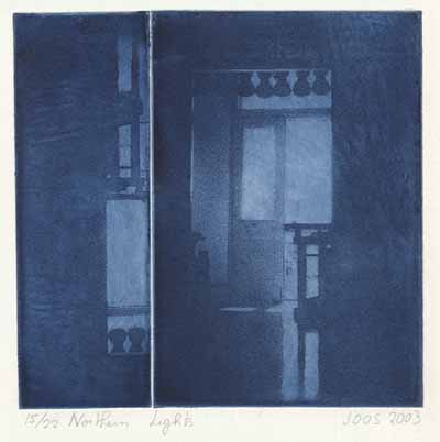
Comments : Conseil québécois de l'estampe
Dawson College, Montreal, Canada
I
have not been outdoors very much lately. The last six weeks temperatures
were averaging -20C with the wind-chill factor it felt like -40C.
I am waiting for Spring as I look at the outside world through the window;
the sky is a cold blue, changing to a slightly purplish hue as the sun sets
around 4PM.
Title
of the print:
NORTHERN LIGHTS
Place of impression:
Ateliers Graff, Montreal, Quebec, Canada
Year of completed edition:
2003
Process:
Photopolymer plate, intaglio
Type of support:
BFK Rives, 250gr
Dimensions:
Paper: 38
x 28 cm|
Image:
15 x 15cm|
Pull:
2 prints, 1 Artist's proof

Alumigraph
’Memories of summers past’
The plant matter in the composition is Queen Anne’s Lace, some fern fronds, and some ’tree moss’ of the tillandsia family. The plate was inked with a simple roll-up of Gamblin Sepia etching ink, and then it was printed on BFK Rives paper
Jeanne Norman Chase
- Florida USA
Webpage: www.jeannenormanchase-art.com
Comments : National PenWomen, Florida Artist Group
Womens Contemporary Artists, BFA, University of
California at Northridge, California
'Bird Lady' Etching on Rives paper with Daniel Smith Intense black
I visit our local park a lot and Florida is noted for its retirees. So many of them are alone and like to visit our park and feed the birds. It is also a nice place for the older folks to meet others that are alone. My subject matter is usually figurative. Lone figures fascinate me as we are all really alone in this world. Happily or unhappily. Who is to say that this lady feeding the birds is alone in the world, took her time to go to the park to feed the birds, has a family at home or is homeless. She is at one with nature and is happy.Barbara Patera -
Issaquah, Washington USA
Webpage: http://members.tripod.com/~hollandART/BP-index.html
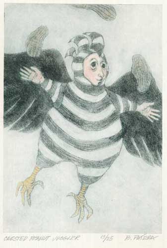
Title:
"Crested Peanut Juggler"
Plate: Drypoint on copper
Paper: Magnani Pescia
Ink: Charbonelle Etching
Edition:
25 plus 3AP
Minna Sora - Tampere Finland
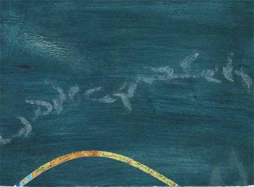
'Heights'
I was going to include a whole multitude of things in this picture. At last just open air and feeling of freedom seemed to be essential. I’ve admired the swaying lines birds draw in the air, how they use upstrokes and downstrokes, and how they take off or land. I’m not alone. These things have fascinated humans for a long time. See for example http://www.ornithopter.org/flapflight/birdsfly/birdsfly.html
Intaglio
with woodplate (birch), drypoint, a zink tray and chine collé
Paper: Hahnemühle 300 gr, old maps from schoolbooks
Jared Thornton -
Tyler, Texas
Comments : The University of Texas at Tyler, Student
Southern Graphics Council, Member
'Quanti.fy1'
Paper:
Incisioni White
Substrates: Zinc,
16 guage
Methods:
Intaglio, Two
independent plates, , Single-run,
Chine collé, Aquatint,
Open-bite, Spit-bite, drypoint

Co-ordinator: Julia
Wakefield - Aldgate SA
Comments : Founding member of Print South West, Somerset,
UK.
Currently
working at Main Street Editions Workshop, Hahndorf, South
Australia.
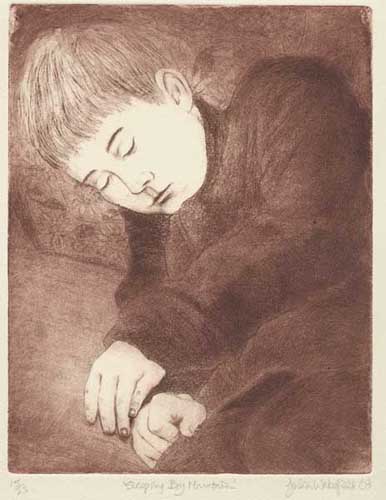
’Sleeping Boy Mountain’,
Copper plate ferric chloride etching, aquatint and drypoint, on Hahnemuhle paper, printed with Charbonnel etching ink.
The image was partly inspired by Mary Cassatt’s etchings in the style of Japanese woodcuts. Although I chose to do a traditional etching for this exchange, I was experimenting with the concept that the metal plate can be changed in subtle ways with each printing. Not only were there variations caused by hand wiping, but also the fact that the drypoint lines had to be reinforced after a number of pulls resulted in a barely perceptible sequence of changes in the facial features. This kept me amused while I was printing, and guarantees that everyone will have a truly unique image.
Melissa Wright -
Rileys Hill NSW
Comments : Did my art years in the USA- Calif. College of
Arts & Crafts,
then Boise State University with George Roberts (I was
his TA for 2 years),
many moons later I find myself in Australia with my own
printmaking studio,
living a great life...
’Two Women Discussing Picasso’
Medium: zinc plate etching and aquatint printed with Faust Sepia ink, separate embossing plate (made from mat board), Magnani Pescia paper
I have worked in a fairly traditional printmaking mode for the past 30 years. I am most at home with etching and other intaglio methods.
I am very impressed with all of Picasso’s work (although the man leaves a lot to be desired.…). I saw a retrospect of his work in 1980 at the MOMA in NYC. Awesome! While in Paris a few years ago I was again inspired when I went to the Picasso Museum, the Centre Pompidou and the Musée d’Orsay. Now there is an exhibition of his work in Sydney. I admire the way he could span so many boundaries of expression and use such diverse voices to get his ideas across. And then there are the relationships he had with women. The spectator and the sculpture are discussing the great man (beast?) while their thoughts and feelings swirl around in the embossed Picasso-esque images. I chose sepia ink in keeping with the bronze colour. I used a traditionally drawn figure, an abstract bronze and his free formed images of people, guitar and animals to further reflect his vast array of expression. This piece was done purely and simply for the fun of it.
All images copyrighted to the artists
© Print Australia 2003
This page last edited 04/10/2003